

Choosing wall art can feel a bit overwhelming when you’re staring at blank walls and endless online catalogs. The right piece does more than just fill empty space, it sets the mood, pulls your room together, and reflects your personal style.
The key to choosing wall art is matching the size to your furniture (aim for two-thirds to three-quarters the width), hanging pieces at eye level (57-60 inches from the floor), and selecting colors that either harmonize with or complement your existing decor.
Most people make the same mistakes: hanging art too high, picking pieces that are too small, or choosing colors that clash with the room. You don’t need a design degree to get this right.
Simple formulas for sizing, clear rules for placement, and a few smart color-matching strategies will help you make decisions you won’t regret.
This guide walks you through how to select, size, and hang wall art in your living room, bedroom, kitchen, office, and more. You’ll find practical tips that work in real homes, plus a few standout pieces that fit popular styles and budgets.
Key Takeaways
- Size your wall art to two-thirds or three-quarters the width of the furniture beneath it and hang the center at 57-60 inches from the floor
- Match art colors to your existing textiles or use complementary colors from a color wheel for a cohesive look
- Choose themes based on room function, like calming art for bedrooms, energizing pieces for kitchens, and professional styles for offices
Fundamentals of Choosing Wall Art
Start with understanding your space’s purpose, recognizing your tastes, and taking accurate measurements. These three basics guide your decisions and help you dodge the usual mistakes, like buying art that’s too small or doesn’t match your room’s vibe.
Understanding Room Function and Mood
Each room in your home serves a different purpose, so your wall art should support that function. Living rooms benefit from conversation-starting pieces that show your personality and welcome guests.
Bedrooms need calming artwork that helps you relax, like soft landscapes or abstract pieces in muted tones. Think about the emotions you want to create.
Warm colors like reds and oranges make spaces feel cozy and energetic. Cool blues and greens create a peaceful atmosphere.
Your kitchen might work well with food photography or bright, cheerful prints. Home offices need focused, inspiring pieces that won’t distract you.
The mood you’re building should align with how you use each space. A dining room can handle bold, dramatic art that sparks conversation. A nursery calls for gentle, soothing images that help kids feel safe.
Identifying Your Personal Style
Your wall decor should reflect who you are, not just what’s trendy. Look at your existing home decor and see what colors, materials, and shapes you gravitate toward.
Do you like clean lines and minimal designs, or prefer something layered and eclectic?
Consider these common style categories:
- Modern: Clean lines, abstract pieces, bold colors
- Traditional: Classic paintings, landscapes, ornate frames
- Rustic: Nature scenes, weathered textures, earth tones
- Minimalist: Simple designs, monochrome palettes, sparse arrangements
Don’t feel boxed into one style. It’s pretty common to blend elements from different looks and end up with something that feels like you.
Assessing Wall Space and Measuring Your Walls
Before you shop, grab a tape measure and jot down the width and height of the space you want to fill. It only takes a minute and makes things easier later.
Artwork should cover about 60-75% of the available wall space. For art above a sofa, aim for roughly two-thirds the width of the furniture.
A big piece on a small wall feels cramped. A tiny print on a huge wall just disappears.
Pay attention to the space around your art too. Leave 2-4 inches between pieces in a grouping.
Hang art with its center at eye level, usually 57-60 inches from the floor. These little tricks help your home feel balanced and intentional.
Types of Wall Art and Materials
Wall art comes in lots of formats, each with its own vibe, texture, and durability. Knowing the core types, from paintings to textiles, helps you pick the right medium for your room’s lighting, humidity, and style.
Paintings and Original Art
Original paintings bring a unique energy to your walls. You’re getting real brushstrokes and texture, straight from the artist’s hand, on canvas, wood, or paper.
Oil and acrylic paintings make great focal points in living rooms and dining spaces. Watercolors work well in bedrooms and studies because their softer palette feels calming.
Gouache and mixed-media pieces add layered interest in creative spaces like home offices or studios.
Framing matters. Unframed canvases feel casual and modern. A floating frame adds a shadow gap that lifts the piece and gives it a gallery vibe.
For works on paper, use UV-protective glass to prevent fading if your room gets a lot of sun.
Original art costs more, but it holds value and tells a story that prints just can’t. If you’re on a budget, check out emerging artists at local galleries or online.
Art Prints and Photographs
Prints and photographs let you get high-quality imagery for less. They’re versatile, easy to swap out, and come in just about every style.
Canvas prints arrive ready to hang and don’t need a frame. They’re great if you have a bright space and want to avoid glare.
Framed art adds polish and protection. Go for acrylic glazing if you’re worried about weight or have kids running around.
Metal prints bond the image right to aluminum, which gives bold contrast and a modern edge. They’re tough enough for kitchens and bathrooms.
Photographs, especially black-and-white or architectural shots, look sharp in offices, hallways, and minimalist spaces. For bedrooms, try soft landscapes or botanical close-ups.
In dining areas, food photography or travel prints can get people talking.
Print quality matters. Look for archival inks and acid-free paper so your art doesn’t yellow over time. Giclée prints use fine-art inkjet tech and can rival original paintings for detail.
Textile and Fabric Art
Tapestries, woven hangings, and fabric art soften hard surfaces and help absorb sound. They’re ideal for rooms with lots of tile, concrete, or glass.
Tapestries can range from traditional woven scenes to modern macramé. Hang them above beds, sofas, or in entryways for warmth without the weight of a frame.
Fabric prints on linen or cotton work in casual spots like playrooms, laundry rooms, or covered patios.
Textiles handle humidity better than paper, but they still need some ventilation. Don’t hang them in steamy bathrooms unless you have a good exhaust fan.
Dust them now and then with a soft brush or vacuum attachment to keep them fresh.
If you love boho, coastal, or Scandinavian looks, textile art adds the organic texture you need to balance all those clean lines and neutrals.
Sculptural and Mixed Media Pieces
Sculptural wall art and mixed media combine materials like metal, wood, resin, and found objects. They bring shadow, dimension, and a sense of movement that flat art just can’t match.
Metal wall sculptures fit well in modern and industrial spaces, like geometric shapes or abstract forms. Wood assemblages bring warmth to rustic, farmhouse, or mid-century rooms.
Resin pieces add color and gloss. They’re striking in contemporary kitchens and offices.
Placement tip: Give sculptural art some breathing room. Hang it on a large wall by itself or with simple, low-profile furniture so it stays the star.
Avoid crowding it with gallery walls or busy patterns.
Mixed media pieces, like collages or layered panels, suit creative spaces and eclectic interiors. They invite people to take a closer look and feel more collected than coordinated.
Wall Art Sizing and Placement Essentials
Getting the right art sizing and placement can make the difference between a room that feels complete and one that looks unfinished. You just need to understand some basic proportions, hanging heights, and how to arrange multiple pieces.
Art Sizing Formulas and Size Calculators
The two-thirds ratio is the big rule here. When you hang art above furniture, your piece should be 60-75% of the furniture’s width.
For a 90-inch sofa, look for art that’s at least 60 inches wide. For a 60-inch console table, aim for 40-45 inches.
You can use a wall art size calculator or just do the math. Multiply your furniture width by 0.67 for the minimum width.
A king bed at 76 inches wide? Go for art around 50 inches wide.
Quick sizing reference:
- Above 90-inch sofa: 60-68 inches wide
- Above 60-inch console: 40-45 inches wide
- Above king bed: 50-57 inches wide
- Above queen bed: 30-45 inches wide
If you want a single statement piece, go bigger. A large canvas makes a bold impact and honestly, it’s easier than planning a bunch of smaller pieces.
For smaller art, create a gallery wall where the total arrangement matches those proportions.
Ideal Placement: Height, Breathing Room, and Groupings
Hang your art so the center sits at 57-60 inches from the floor. That’s about eye level for most people and just feels right.
When you place art above furniture, leave 6-10 inches of space between the top of the furniture and the bottom of your art. This connects the pieces without squishing them together.
For beds, use 6-12 inches above the headboard. For sofas, stick to 8-10 inches.
To find your hanging height:
- Mark 57 inches up from the floor
- Measure your artwork height and divide by 2
- Measure from the center to the hanging hardware on the back
- Add that measurement to 57 inches for your nail placement
In dining rooms where you’re mostly sitting, drop the center to 52-54 inches so the art lines up with your seated eye level.
Gallery Walls: Layout, Spacing, and Design
A gallery wall takes planning but gives you lots of freedom to mix frame sizes. The total arrangement should still follow the two-thirds rule for the wall or furniture below.
Space individual pieces 2-4 inches apart for a tight, cohesive look. Use 4-6 inches if you want more breathing room between frames.
Mix two or three larger pieces (24×36 inches or bigger) with four to six smaller ones (8×10 to 11×14 inches).
Common gallery wall layouts:
- Grid layout: Same-size frames in neat rows with even 2-inch spacing
- Salon style: Mixed sizes arranged around one big anchor piece
- Horizontal line: Different sizes but all centers lined up at 57 inches
- Vertical stack: Pieces stacked in a column for narrow walls
Before you grab the hammer, cut paper templates of your frames and tape them to the wall. Live with the arrangement for a day and tweak it if something feels off.
This saves you from making a bunch of unnecessary holes and helps you see how it’ll actually look.
Color Coordination and Theme Matching
The colors and themes in your wall art should work with your room’s palette to create a balanced, unified space. Matching hues and picking the right artistic themes helps you get the mood you want.
Matching Art to Room Colors
Start by noticing the primary colors already in your room. Look at your walls, furniture, curtains, and decor to see which shades pop out.
Try a color wheel to spot colors that naturally complement your room. If your space is mostly neutral—think beige, gray, or white—you’ve got freedom to play with almost any color family.
Bolder wall colors? Go for art that matches the dominant shade or picks up on accent colors in your pillows, rugs, or smaller pieces.
Consider these practical approaches:
- For darker rooms, art with lighter or brighter colors can really lift the mood
- In bright spaces, deeper tones in your artwork add sophistication and depth
- Monochromatic rooms come alive with art in varied shades of the same color, keeping harmony intact
Check the undertones in both your paint and potential artwork. Warm beige walls pair better with art featuring warm undertones, while cool gray walls vibe with cooler color schemes.
Using Complementary and Accent Colors
Complementary colors sit opposite each other on the color wheel and bring dynamic energy when paired. If you’ve got blue walls, try artwork with orange or rust tones. Purple walls? Yellow accents in your art can work wonders.
Accent colors show up in small doses around your room and give you another way to coordinate. Got teal pillows or a burnt orange chair? Hunt for art with those shades. It ties things together without needing an exact match.
Effective color strategies include:
- Use art to introduce a new accent color you want to spread through the room
- Pick pieces with multiple colors that bridge different parts of your decor
- Balance warm and cool tones so your space doesn’t feel flat
Bold abstracts often help when you want to bring in a bunch of accent colors at once. These pieces usually feature several hues that can connect the dots in your room’s color scheme.
Choosing Themes for Atmosphere and Cohesion
The theme of your wall art shapes the emotional vibe of your space. Serene landscapes and botanical prints create a calm, relaxing mood—perfect for bedrooms or reading nooks.
Nature-based themes feel especially right where you want rest and tranquility. If you want more energy, bold abstracts can wake up living rooms or creative corners. Abstracts are more flexible for color, too, since they’re not tied to real-world subjects.
Match themes to room function:
- Bedrooms: serene landscapes, soft botanicals, or gentle abstracts
- Living rooms: dynamic themes like cityscapes, bold abstracts, or dramatic photography
- Dining areas: food art, wine country scenes, or vibrant still lifes
Stick to a consistent theme within each room or connected space. Too many different themes can make things feel busy and a bit chaotic.
Styling Tips and Finishing Touches
The right frame, decent lighting, and a little layering can turn good wall art into something that really finishes your space. These details protect your art and help your room feel complete.
Frame Selection and Hanging Hardware
Pick a frame that fits both the art’s style and your room’s vibe. Modern art pairs well with sleek metal or simple wood frames, while traditional pieces look better in ornate or classic wood frames.
Float frames give a contemporary feel by suspending art between two pieces of glass. This works great for canvas prints and abstracts, adding depth and a touch of luxury.
Consider these frame guidelines:
- Match frame width to art size—bigger art needs thicker frames
- White or black frames are versatile and move easily between rooms
- Natural wood frames warm up bedrooms and living areas
- Metal frames are smart for bathrooms and kitchens because they handle moisture
Choose hanging hardware based on your wall and art weight. Picture hooks work for lighter pieces up to 20 pounds. Heavier art needs wall anchors or studs. D-rings and wire suit most framed art, while sawtooth hangers fit smaller works.
Mixing Mediums for Depth and Texture
Mixing different art types adds interest without making your walls feel crowded. Pair framed art with metal sculptures or woven pieces to add dimension. This approach stands out in living rooms and entryways.
Layer art on shelves or mantels with plants or books for a casual, personal look. Start with the biggest piece in back and move forward with smaller items.
Effective mixing strategies:
- Combine photography with line drawings for contrast
- Mix canvas prints with framed art for texture
- Add a mirror to bounce light and open up smaller rooms
- Balance busy patterns with solid colors or minimalist pieces
Keep a common thread across mixed pieces—maybe a color, frame style, or theme—to tie everything together.
Lighting and Longevity of Wall Art
Direct sunlight fades art fast. Hang pieces away from windows or use UV-protective glass for framed art in bright spots. Gallery walls in hallways usually last longer since they get less sun.
Picture lights above framed art give a museum vibe and highlight favorite pieces. LED strips are good for gallery walls and won’t add heat that could hurt your art.
Clean framed art every few months with a dry microfiber cloth. Wipe dust from the frame and glass, but skip cleaning products that could sneak behind the glass. For canvas or unframed art, use a soft brush to gently dust.
Bathrooms and kitchens are tough on art because of humidity. Use sealed frames with backing boards to protect prints. Metal and acrylic art handle these spaces way better than paper or canvas.
Room-by-Room Wall Art Recommendations
Every room in your home has its own purpose and needs art that fits. The right wall art ties your decor together and sets the mood, whether you want energy or calm.
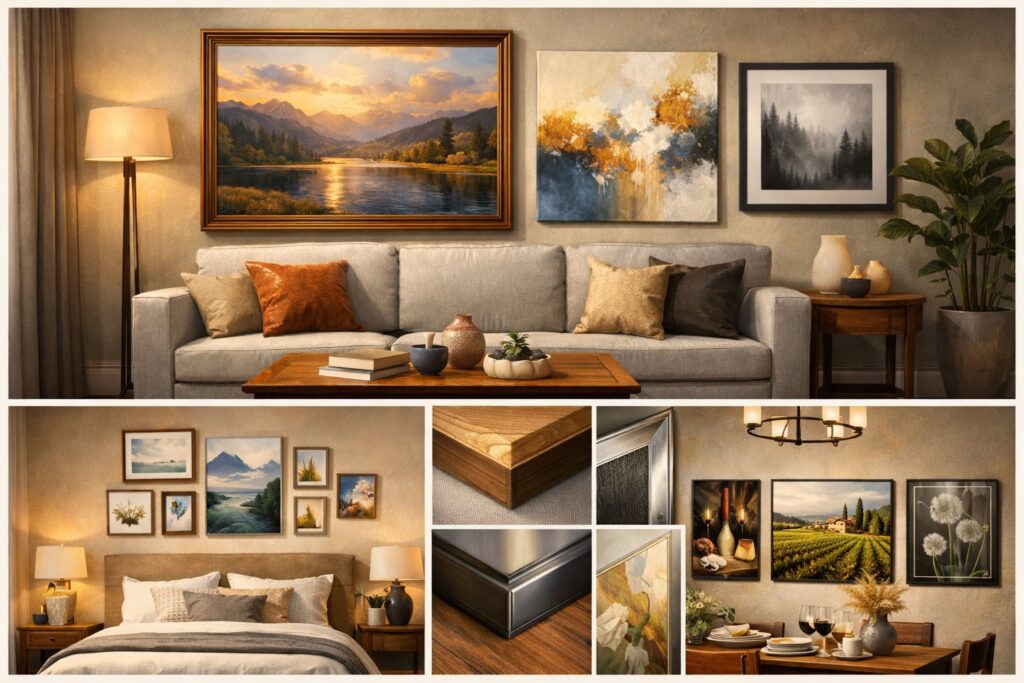
Living Room: Impactful Focal Points
Your living room needs a strong anchor piece that grabs attention without overpowering everything else. Look for art that’s about two-thirds to three-quarters the width of your sofa or console.
Large abstracts work well—they’re interesting but don’t compete with conversation. Cityscapes and landscape horizons create movement across your seating area. Got a long sectional? Try two big pieces instead of one centered print.
Scale matters more here than anywhere else. Too-small art looks lost above your furniture. Painter’s tape helps you visualize before you hang anything.
For modern living rooms, black and white photography adds sophistication without clashing with color. Gallery walls look great here, too, if you keep 3-6 inches between frames and choose one piece to anchor the group.
Bedroom: Calm and Personal Spaces
The bedroom should have softer imagery that helps you relax. Botanicals, serene wildlife, and minimal abstracts keep things peaceful.
Matte finishes beat glass if your art faces morning windows—glare ruins the calm. A diptych above the headboard feels orderly but not too stiff.
Pick art that’s 60-80% of your mattress width. Low headboard? Go taller. High headboard? Go wider to balance things out.
Gentle earth tones and muted palettes work best here. Pull colors from your bedding or rug for cohesion. Wildlife prints in warm neutrals add personality without disturbing the restful mood. Steer clear of high-contrast or energetic pieces that keep your mind buzzing at bedtime.
Kitchen and Dining: Playful and Inviting Choices
Kitchens can handle playful prints that might feel out of place elsewhere. Food art, vintage typography, and bright still lifes match the energy of cooking and gathering.
Open shelving? Lean a framed print behind canisters or your coffee setup. It’s a quick way to add interest without needing extra wall space.
Keep art away from direct steam and splatter. Go for sealed canvas or framed prints with protective backing. Botanical and coffee-themed art just feels right in these spaces.
Dining areas do well with art that sparks conversation. A small gallery wall of food prints or market scenes keeps things light and social. Frame sizes can be smaller here since folks are usually seated.
Entryway and Office: Welcoming and Inspiring Art
Your entryway sets the tone for your whole home. Choose one confident piece over lots of tiny frames. Vertical art works especially well in narrow spaces, drawing the eye up and making things feel taller.
Office art should reduce visual fatigue and look professional. Black and white photography, calm abstracts, and structured landscapes fit both home offices and clinics.
Monochrome pieces feel timeless and won’t distract during focused work. Nature studies and architectural prints give subtle interest without demanding attention. Light oak frames warm up stark office walls, while black frames keep things sharp and modern.
In waiting areas or client offices, aim for gentle interest rather than bold statements. Art should feel welcoming but not provoke strong reactions that could throw off a visitor.
Top Wall Art Product Recommendations
Quality materials, thoughtful design, and proper sizing make all the difference. The right canvas, frame, or textile brings color, texture, and a bit of personality into your home.
Recommended Large Canvas and Statement Pieces
Large canvas prints work best above sofas, beds, and in living rooms where you need a strong focal point. Look for pieces between 40 and 60 inches wide that match about two-thirds to three-quarters of your furniture’s width.
Abstract & Geometric canvases fit modern and contemporary spaces. Pick designs with two or three colors pulled from your existing textiles for visual harmony. These pieces usually arrive ready to hang with sturdy stretcher bars and hardware.
Cityscape and landscape statement pieces add depth to blank walls. Horizontal panoramas stretch tight spaces, while vertical formats lift the eye in rooms with standard 8-foot ceilings.
Canvas gives a matte finish that cuts glare in bright rooms. The texture adds warmth you just don’t get from framed prints behind glass. Look for archival-quality inks rated for 75 years or more of fade resistance.
Top Picks for Prints and Floating Frames
Floating frames create a modern shadowline effect that adds depth to prints. The art seems suspended between the mat and frame face, making even simple prints feel special.
Pick black frames for high-contrast modern spaces with white walls and metal accents. Light oak frames warm up Scandinavian and coastal rooms without clashing with neutrals. White frames fit cottage and transitional styles.
Acrylic glazing weighs half as much as glass and resists shattering, so it’s great for high-traffic areas, kids’ rooms, and stairwells. Museum-grade acrylic blocks 99% of UV rays, protecting delicate papers and watercolors from fading.
Standard print sizes (16×20, 18×24, 24×36 inches) fit ready-made frames at any price. Prints let you swap out seasonal themes without a big redesign. Keep extras handy and rotate them every few months for easy updates.
Best Options for Textile and Fabric Wall Art
Tapestries and fabric wall hangings really help soften up hard surfaces in bedrooms, dorms, and lofts. They add acoustic dampening that canvas and prints just can’t offer, especially in echo-prone spots with hardwood floors.
Woven tapestries with boho, botanical, or geometric patterns fit relaxed interiors. Hang them with a dowel rod and leather strap if you want that layered, collected vibe.
Sizes range from 50×60 inches up to 80×90 inches, so you can cover a big wall without dealing with the weight of framed art. It’s a lot less hassle than you might expect.
Macramé wall hangings and fiber art bring in organic texture. Pair them with minimal furniture to let the textile stand out as the room’s main attraction.
Stick with neutral tones like cream, taupe, or gray, since those layer over pretty much any wall color. It’s hard to go wrong with those shades.
Fabric art usually ships flat and you can install it in minutes using small nails or adhesive hooks. Most textiles handle spot cleaning with mild detergent, so they’re practical for rentals or high-traffic areas where glass just isn’t ideal.
Frequently Asked Questions
Wall art sizing follows some tried-and-true formulas, but color matching really depends on your existing textiles and a basic sense of what colors work together. Placement height usually centers around eye level, and coastal pieces look best when they echo natural textures.
What are the best practices for choosing the size of wall art for a living room versus a bedroom?
For your living room, art should measure about two-thirds to three-quarters the width of your sofa. This keeps things balanced without making the furniture feel dwarfed.
Leave 6 to 10 inches of space between the top of your sofa and the bottom edge of the art. It makes a difference, trust me.
In bedrooms, the same idea applies, but adjust for your mattress width instead. Aim for art that’s 60 to 80 percent of your mattress width if you’re hanging it above the bed.
If you’ve got a tall headboard, go wider instead of taller to keep the proportions feeling right. It just looks better that way.
Try to hang the center of your art at 57 to 60 inches from the floor in both rooms. That puts the focal point at about average eye level.
You might want to go a bit lower in bedrooms where you spend more time sitting or lying down.
Can you provide styling tips for incorporating wall art into a specific room theme?
Match your art’s mood to the room’s purpose. Pick restful botanical prints or calm wildlife for bedrooms where you want a little peace.
In living rooms or offices, go for energizing abstracts or cityscapes if you’re after more conversation and movement.
Pull colors straight from your existing textiles like rugs, pillows, or curtains. It instantly ties your art to the space.
If you want to get fancy, use a color wheel to find complementary colors that add some contrast without making things chaotic.
Stick to one visual story per room. A coastal theme fits with nautical motifs, driftwood, and ocean blues, while an urban theme feels right with cityscapes, architectural photos, and monochrome prints.
Mixing too many themes in one space just ends up feeling scattered.
What are the essential rules to follow when hanging wall art to ensure proper placement and visual appeal?
Hang art so its center sits about 57 to 60 inches from the floor in standard rooms. That way, it’s at eye level for most people.
For children’s rooms or spots where folks sit a lot, you can go a bit lower. It just feels more natural that way.
Leave 6 to 10 inches between the top of your furniture and the bottom of your art. This little gap keeps things from looking cramped.
In gallery walls, keep 3 to 6 inches of consistent spacing between frames. It makes everything look intentional.
Use two hooks for pieces wider than 24 inches to keep them level. Painter’s tape is great for outlining your art’s dimensions before you start hammering nails.
Start from the center of your gallery wall and work outward. It’s easier to get a balanced look that way.
How does one match wall art colors with the room’s existing color scheme effectively?
Begin with your room’s main neutrals like floors, sofas, or bedding. Pick art that either blends within two shade steps of these colors or stands out with high-contrast complementary colors.
Beige, warm gray, and sage usually play well together and feel pretty serene.
Use a color wheel to spot complementary pairs like blue and orange or green and red. These opposites add energy without turning the room into chaos if you balance them right.
Adobe Color has a free palette generator if you want to see complementary and split-complementary options.
Echo one accent color in two or three places around your room. If your art has coral, repeat that color in a pillow or a small vase for a pulled-together look.
What are some unique wall art placement ideas for decorating two adjacent walls in a living space?
Try repeating a color or theme across both walls to create a sense of flow. It connects the spaces without making them matchy-matchy.
You can switch up sizes or orientations but stick to the same color family or subject for cohesion.
A corner gallery works too, where frames wrap around the corner at different heights. This is especially good with smaller prints that step up or down as they turn the corner.
Keep spacing consistent at 3 to 6 inches between frames for a tidy look.
Place a big statement piece on one wall and balance it with smaller, complementary pieces on the adjacent wall. This asymmetrical approach draws the eye without making the walls compete.
The smaller pieces should share at least one color with the larger anchor piece to tie it all together.
Could you recommend a couple of coastal wall art pieces ideal for a nautical-themed room?
An anchor canvas print in muted blues and weathered whites gives you that classic nautical vibe. It really stands out above beds or in a bathroom, and honestly, it just feels calming.
Try to find versions with minimal text and softer colors, not those bright, loud ones. Sometimes the subtle palettes just work better for that relaxed, beachy look.
A coastal landscape with driftwood, sea foam, or even a misty horizon adds a bit of natural texture. I like pieces that are horizontal, since they mirror the ocean’s horizon line.
Canvas prints usually hide reflections better than framed glass, especially in bright rooms with big windows. That little detail can make a big difference if your space gets a lot of sun.


